


UX/UI Design Process Case Study
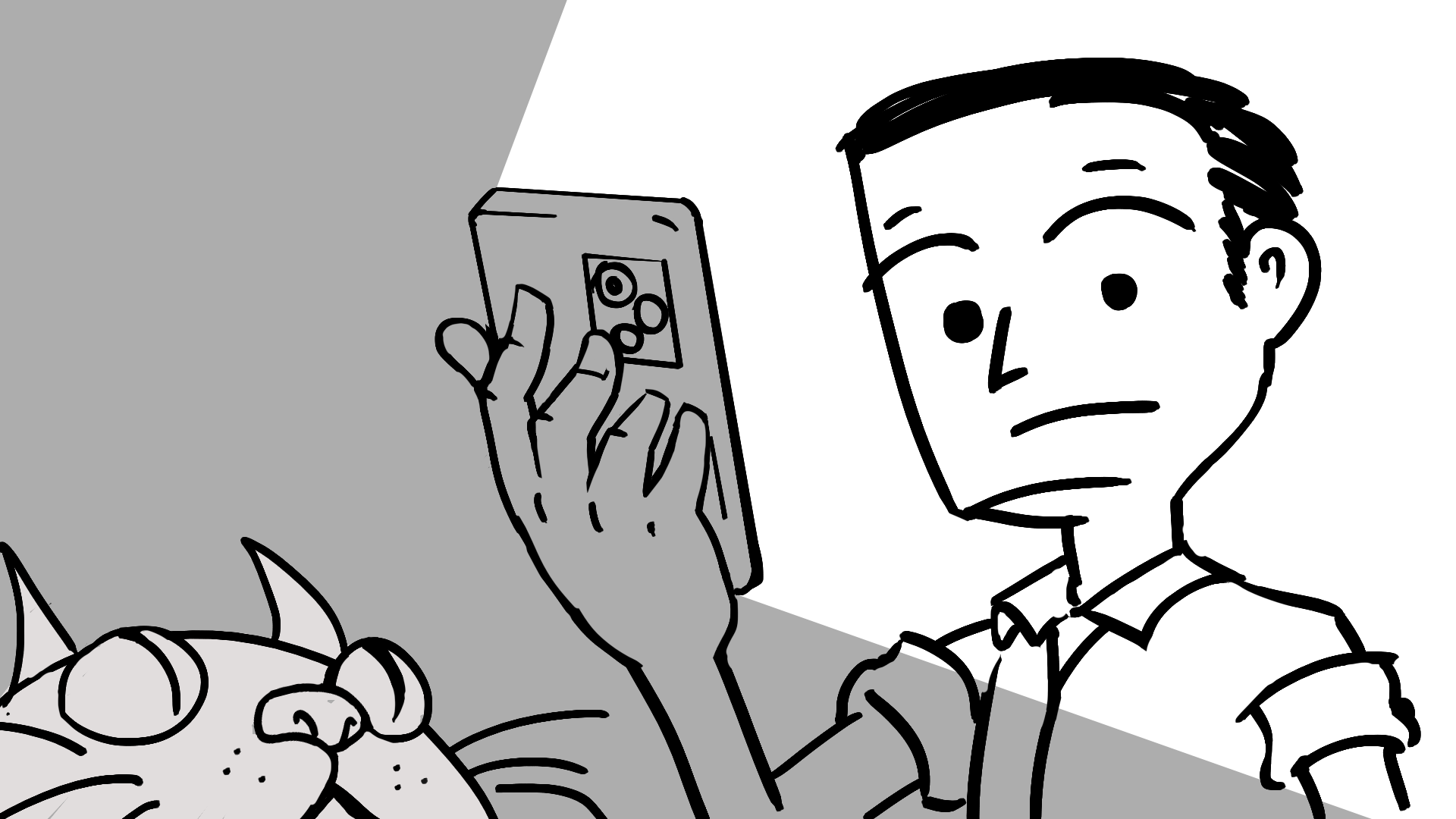
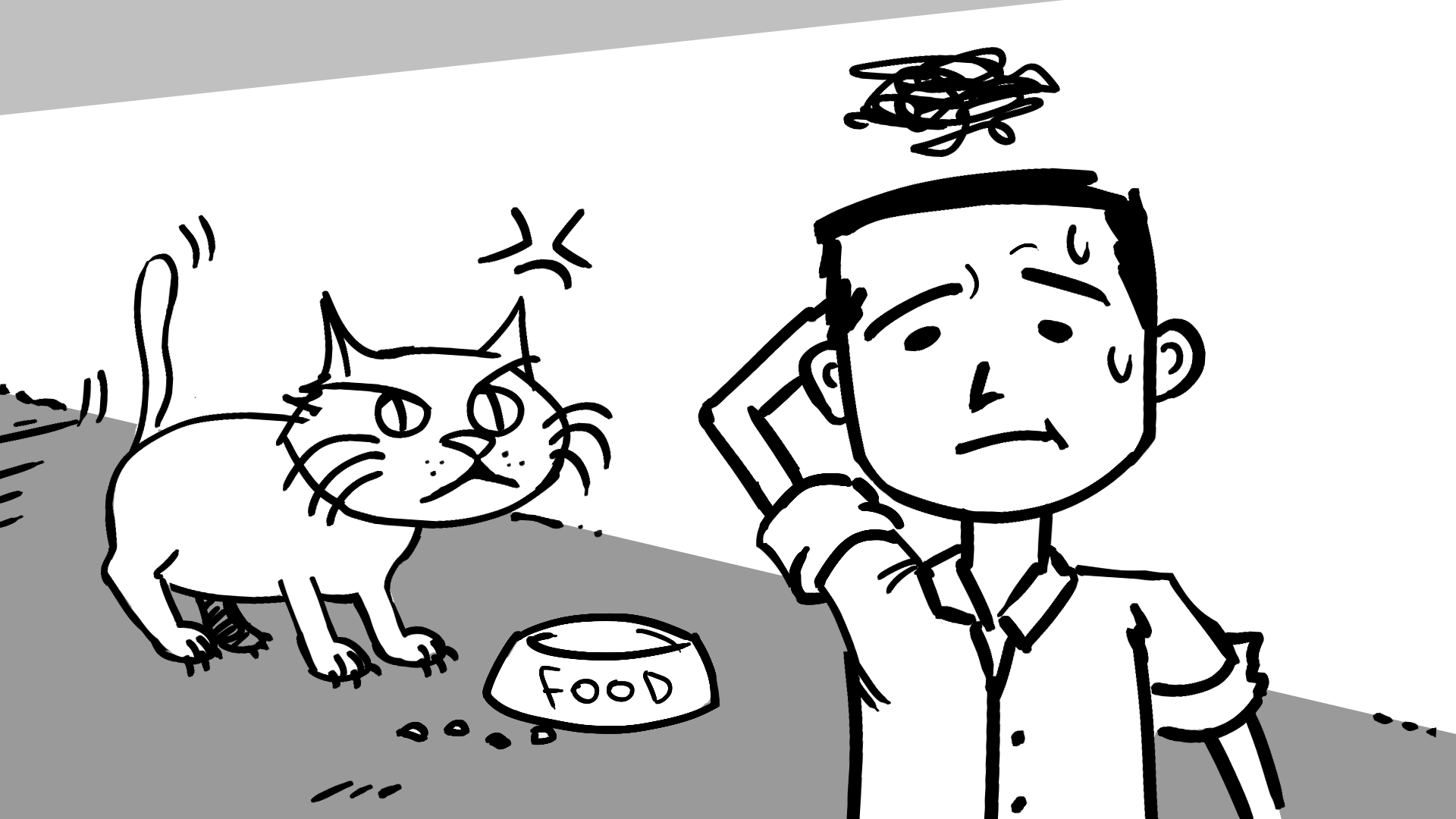
He doesn't have food nor patience...
Pet owners, (specifically in Chile) specially busy ones, struggle to efficiently discover and reliably receive products from independent stores....
...this fragmented journey leads to time-consuming research, anxiety and an unsafe delivery process
Petlov aims to serve as a central hub to make pet food, meds and pet accessories related purchases, with a profile integration for customized carts
A quick no-nonsense way to search and buy products
A tool for pet owners and power users to track their pet needs and purchases
Petlov’s goal is to offer a streamlined way of purchasing the desired products while giving more options for power users to customize their experience and find more ways to get the most of the app itself.
User Research, Data Collection, Organization, wireframing, Prototyping, User Testing, Graphic Design and UI design.
In this project, myself, Marcel Nuñez, was involved in every step of the process, from research, usability studies, storytelling, polls and data
collection, to wireframes and high definition prototypes.
The total of my Google UX Certification, which was 6 months of cumulative effort in every aspect of the project, including the Desktop version project.
• User Research
• Personas
• Pain Points
• User Journey
A poll and an a competitive audit were conducted, method of purchase and pain points were the focus
"How often do you buy pet food on a delivery app like Uber Eats?"
"What's your age?"
"How difficult is for you the pet food buying process?"
I posted this form in all the chilean pet owner hubs I could find that matched the criteria in the country, prioritizing having a broad range of age groups, social status and pet species, the complete results can be seen below ( in spanish )
"The available stock, it’s a complicated topic when specific brands are involved"
"Everything"
"I’d like an automatic service plan, like a subscription with delivery, the hardest part is when I can’t get the same flavors, my dog doesn’t like more than 2"
The goal of this audit was having a clear view of the offer and the ease of purchase for pet owners in specifically in Chile
-Novapets
-Falabela
-Best For Pets
Novapets: good reputation regarding shipping, good website, wide product range
Falabella: established enough to be trustworthy, some niche product offers
Novapets: image is not professional enough, confusing website
Falabella: not a specialized store, click to product number is high, lacking in product range
This are the 2 main personas for this project, based on the poll, the comments and community browsing.
Pet owners often realize that they need pet supplies like food or meds when it's too late, solving this adds more steps and stress.
Online stores are inconsistent, have an ambiguous schedule and can be informal and not reliable.
Buying process involves too many variables, the app that the seller uses, stock, pay method, with no intermediary, or even safety
User can be scammed in multiple ways, older people can be endangered, seller can lie and the process can drag with no accountability.
Uncertainty in a pinch, the user has to search for independent providers to get Pet Food
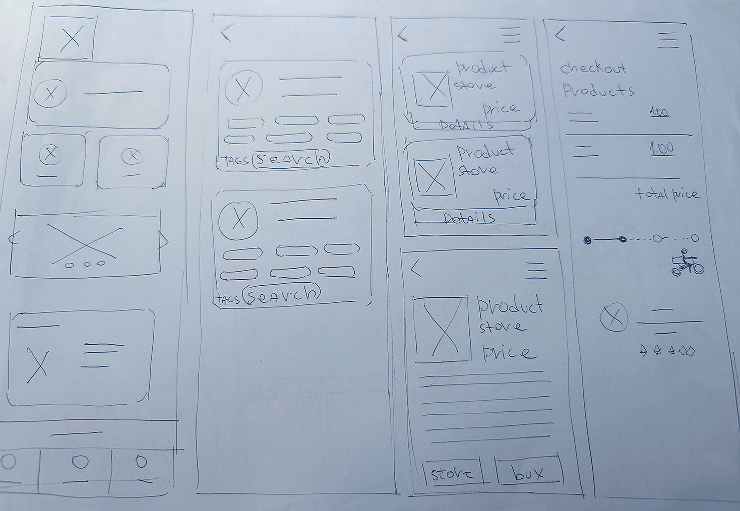
• Wireframes
• Mockups
• First prototype (MVP)
The delivery app ecosystem mixed with a quick delivery option was a concept. from the start
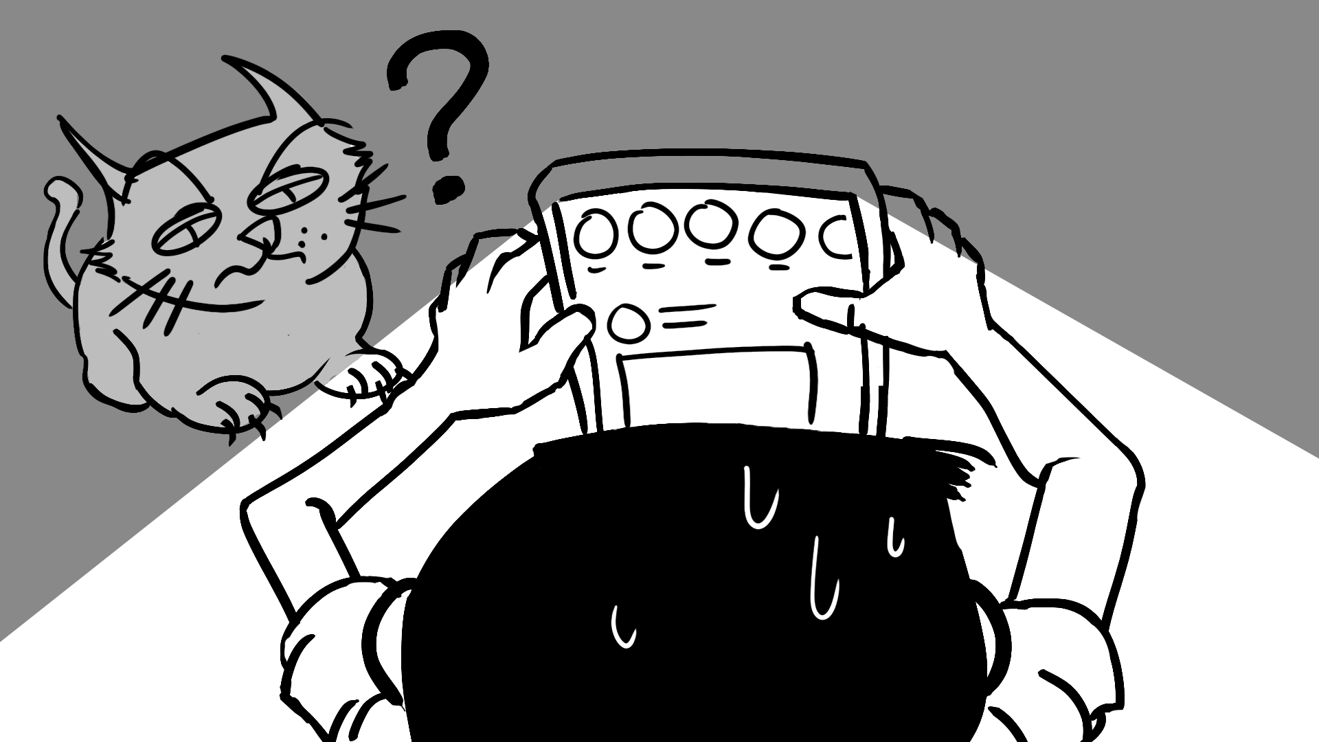
"Why are you drawing? i'm hungry"
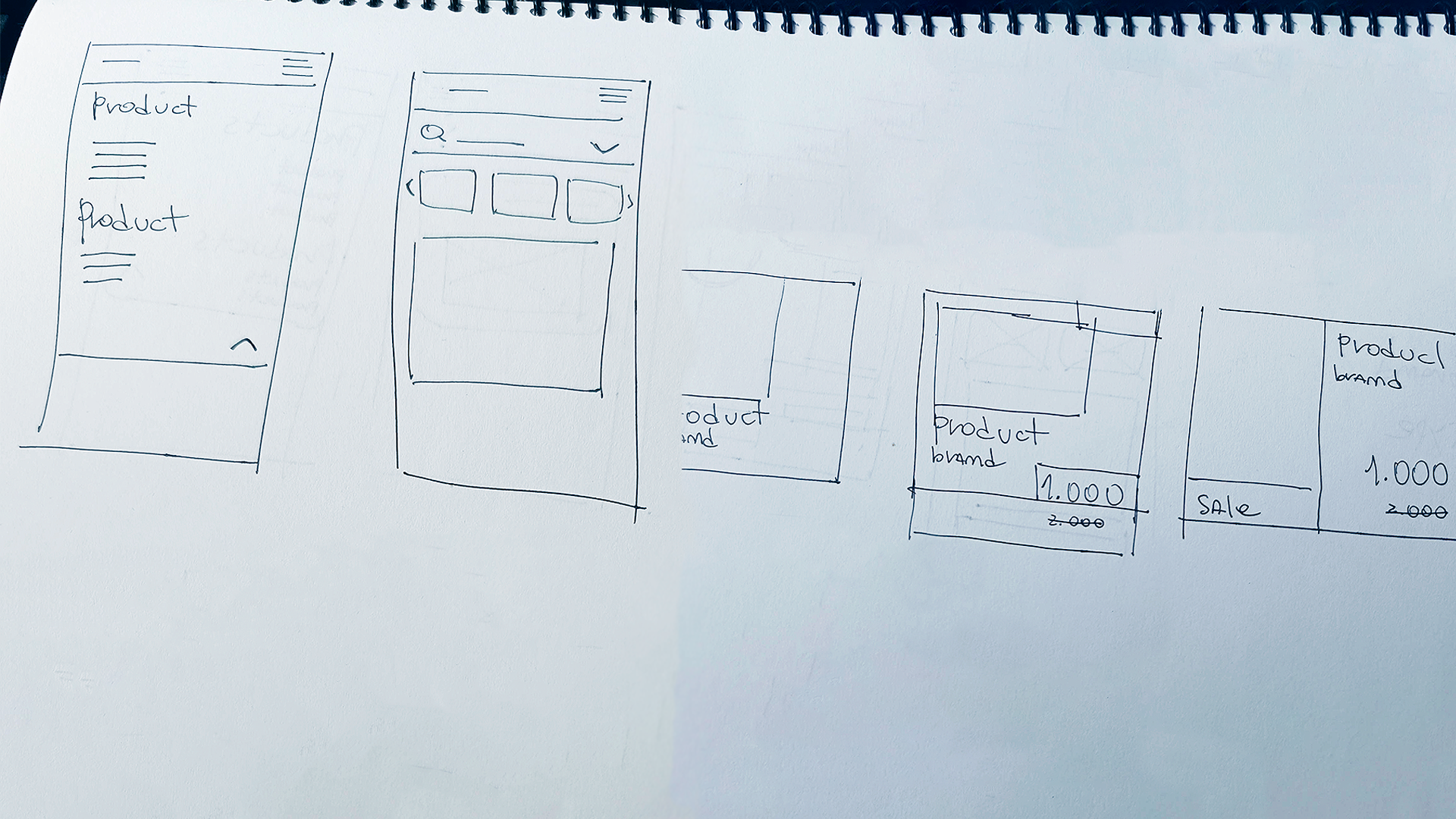
This mockups were made at the beginning of my UX Certification and before I had UI work experience, even then, elements like the tags and the bottom bar were considered
This early mockups can be accessed in the First flow on the Figma project.
• Usability Testing
• Affinity Map
•Insights
Moderated Usability study
Chile, remote testing
6 participants
20-30 minutes
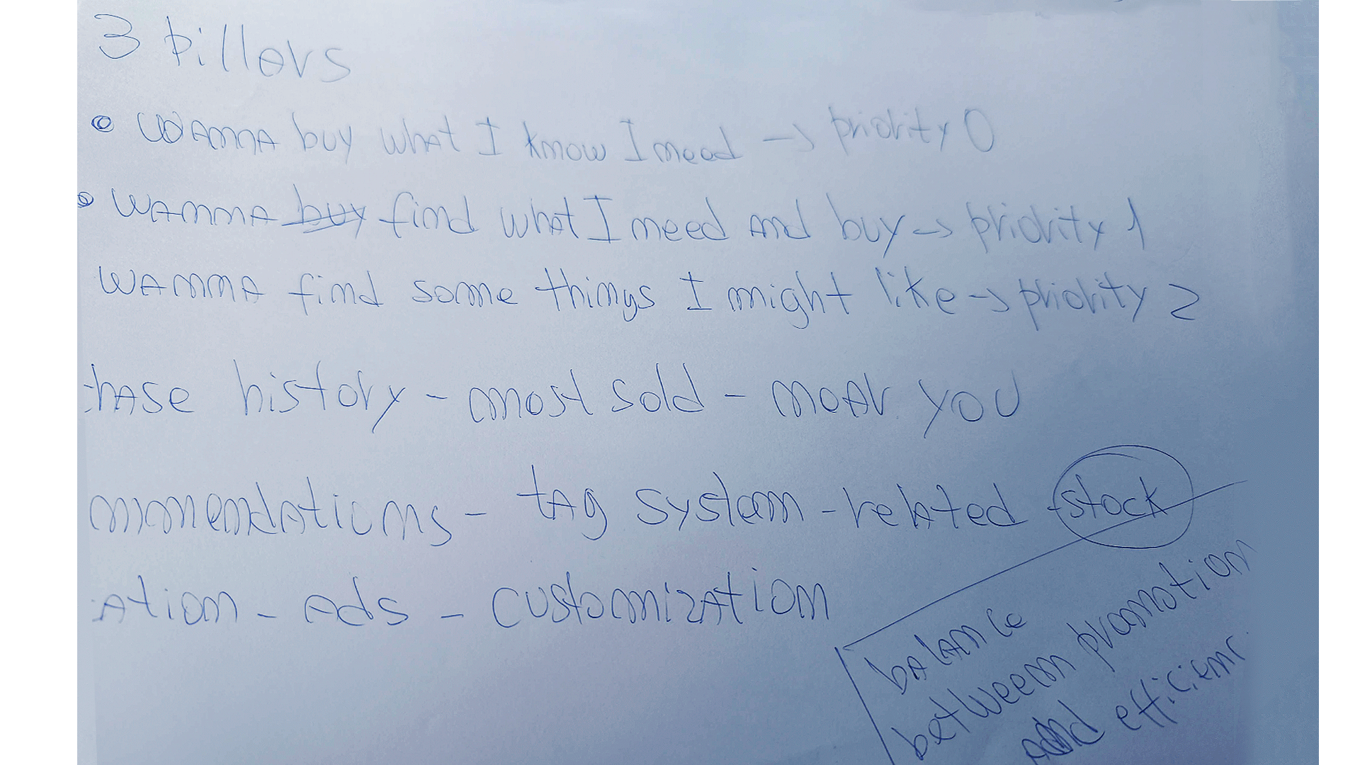
The most important features about the buying process should be streamlined, there needs to be a more evident visual feedback.
It is critical to achieve an aesthetic and layout that balances a good design with accessibility for people that are less knowledgeable in tech.
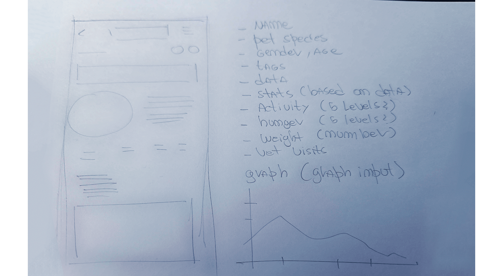
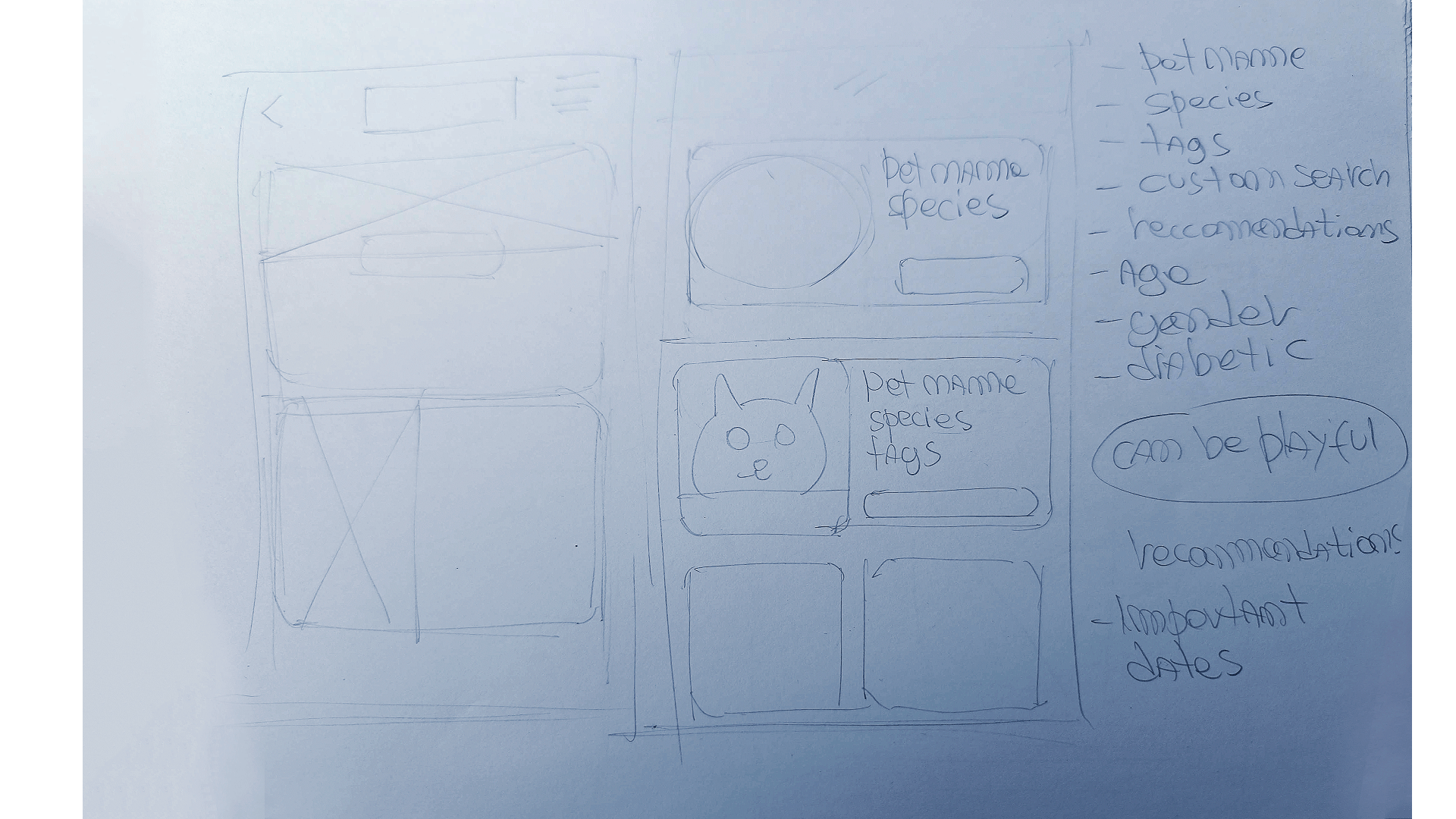
The Pet Profiles feature was well received, but the emphasis, hierarchy and importance of the feature should be rethought, to make actual products easier to find.
The Usability note taking spreadsheet can be found here
• Pet Profiles focused flow was confusing for some
• Older participants had problems with the buying process
• Tech literacy, some users showed unfamiliarity with the buying process
• Most users, want to be able to purchase right away in Home
• Ease to buy is priority, product offers and features come after
• Flow should be suggested not only with text but iconography on key steps.
• User age range is wide and not every segment is familiar with the process
• Wireframes
• Information Architecture
• Mockups
• Prototypes
• Final Designs and Conclusion
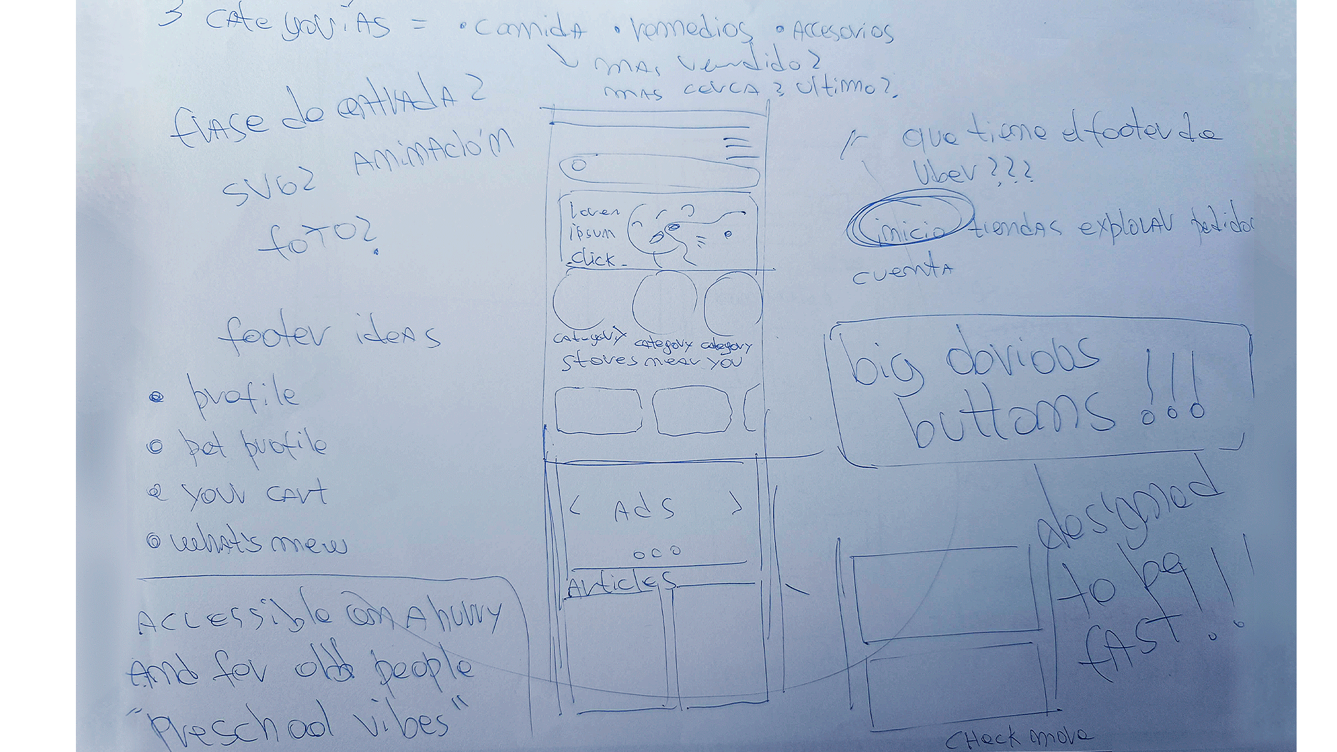
The focus making the information arquitecture was to make the intended "Quick Purchase" as readable as possible, using the J.J. Garett method as a base.
Mainstreaming the buying process and relocating Pet Profiles was the new vision, lots of concepts and ideas were explored and curated.
Feedback into Design...
The order, priority and hierarchy of elements has been calibrated...
...using a bottom bar was decided by looking at proven design formulas, adapting them to the present case context
A green and blue oriented pallete for a sober but not boring branding with dark and visible buttons
Making interactive elements round helps to get a grasp of consistency on what can be tapped
DM Sans offers readability on denser masses of text while SATOSHI offers efficiency for buttons with a round and elegant construction
Exploring products and different categories requires only one tap to trigger a mainstreamed buying flow.
Pet Profiles has the most emphasis at the bottom bar, a tool for pet owners and power users to get data tracking and make custom carts.
Getting my Google UX certification was a hard but fullfilling journey, and this project is the hard proof of that
Learning the methodology process, the deepness of the discipline and the right tools and workflows was revealing for me as a professional
There is a lot that can be done better and a lot to learn from my peers, I am eager to grow in the UX Design landscape, specially in the UI and Interaction areas.
Thanks for your time!